Despite most creative angles of clubbing, nightlife and events being openly appreciated, one aspect that gets somewhat unfairly overlooked is the aesthetic of clubbing, generated by numerous designers and photographers. Here in Ireland, the number of young people involved creatively in the nightlife industry has never been higher, with an abundance of talent in all forms on display on a weekly basis.

It was fitting then to get in touch with two of the city’s best young designers and photographers and let them chime in on why they do what they do and the effect it has on clubbing. We then invited former Boiler Room designer, Caterina Bianchini, to weigh in, given her storied catalog of work, on how she maintains her own style on such a large platform.

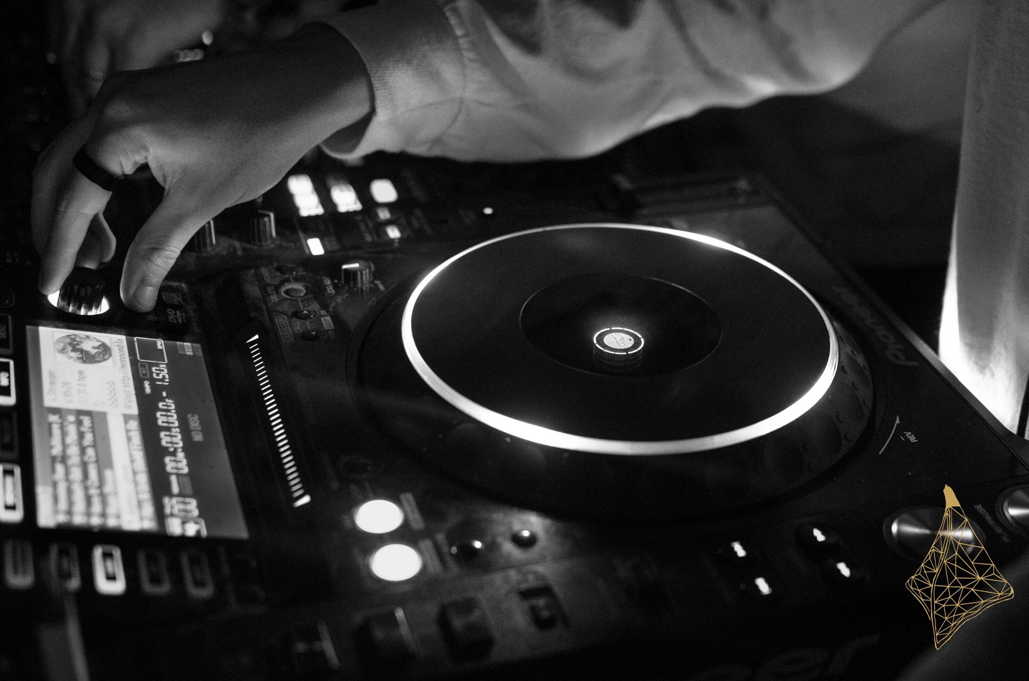
Maely Lim is a 19 year old photographer that mostly employs her trade at the bi-weekly Tea Party night in Wah Wah club, she expands on how she approaches club photography and how she translates the energy on the night through images;

This slideshow requires JavaScript.

‘It’s about producing a picture that people want to remember, people want to remember the excitement of nights out, who they were with, and what was a great moment in time. Trying to take pictures that translate a particular feeling, something that’s not posed but a genuine reaction.
You can really tell what’s just happened from how people look and grab for each other, when someone’s face lights up after hearing something they’ve been waiting for. People don’t dance to heavy stuff the same way they do to say, lo-fi, and you can definitely get a feel for a night by the way everyone’s moving, even in a still image.
Photos of people posed who want a picture with their friends can get really repetitive and makes the job feel like nothing but promotional work. But if people forget they’re being photographed, there’s definitely an opportunity to try document the Dublin club scene that I’m growing up in. That elevates the job from straightforward promotion.’

This slideshow requires JavaScript.

James McGuirk is a graphic designer based in Dublin who produces artwork regularly for Techno & Cans, VereiSeN, District Magazine and World Records. He expands on having a knowledge on the culture he’s producing for.
‘A poster is the first thing you that you see about a night or an event. It has to draw you in. It’s the first contact between the audience and the act or night. As a designer, it’s all about visual stuff. If you don’t get across what your night’s about on a poster, how’re people supposed to know the details of your event if the first thing they see is unclear?
I don’t think my role is overlooked, the people who ask me to make posters generally understand their importance and I’m pretty sure I haven’t had a client that’s been ungrateful, not yet, anyway.
Usually, I try to put as much of my own mark on it as possible, but if a brand or a night has a specific set of guidelines then you can’t really do much about it. Most of the time, I do have free reign to a certain degree, but it depends on who you’re designing for.

This slideshow requires JavaScript.

If you have an event and you put all this work into it, it gets people interested. People are going to pick stuff like that over things that people have mocked up a shit poster for saying: ‘this is on, this is happening’. If there’s a festival on and they have loads of interactive media, a certain part of that is going to make people want to go whether you’re into the acts or not. Personally, that’d make me want to go but maybe that’s because I’m a designer myself!

A lot of it is about what’s on trend at the moment. For example, stuff that’s done in the style of old rave flyers, people are into that at the moment, that’s well received. It’s about keeping an eye on trends rather than putting out plain, old, simple things.

This slideshow requires JavaScript.

If you’re designing for a certain type of music, you have to listen to that type of music. You have to know what the crowd is about, what the act is like. If I’m designing a poster for a minimal techno act, the artwork’s going to be really minimal, real low key. But if the act is really heavy like AnD, it’s going to have pictures of war scenes and bombs going off, it’s just about what kind of music it is and being able to translate the music into imagery.’

Caterina Bianchini is a graphic designer that has worked on numerous posters for Boiler Room, Subclub and many other events. She guides us through her career thus far and shares her thoughts on whether her creativity is appreciated within the scene.
‘I used to just design [posters] and use them as a way to experiment with typography, layout and colour. I have always been so into music I remember I used to make arty music videos in
my spare time to tracks I really loved. I think I did feel a little bit of pressure when I first started working with Subclub as I thought it was the best thing ever and I was pretty young. But they were super chilled out and would let me just do my thing, I loved it and that gave me confidence to just go for it with other clients too.

This slideshow requires JavaScript.

People are definitely more into the music, but music has a feeling and I think if you design a poster that doesn’t work for the type of night it is or the type of people who are playing then people will just not get it or maybe they will just ignore the poster because at first glance they’ve associated it with fashion rather than music. I wouldn’t say it’s about translating noise into image, its more about translating a feeling into image. What does the music make you feel like and how can that be portrayed into something visual that people will understand.
It’s not really overlooked, but I do think the person behind the poster isn’t really recognised, unless you’re massively into design and you go out your way to look it up, which I often do if I see some sick designs related to music.
I rarely get a lot of feedback, but I think I am lucky enough to work with clients who appreciate my style and ask me to work on their projects because they trust and want that aesthetic. If you are working on something and feeling like you are just working on it as a pair of hands rather than the head, then you should not work with that client again. I hate it when I work with people like that, it completely devalues the whole reason they got in touch with you in the first place. Also, as a designer you don’t want work to be published that doesn’t convey your style.

This slideshow requires JavaScript.


It has to be something that catches people’s eye when their mate has clicked “attending” on Facebook. As a designer, I am always drawn to things because of their visual aesthetic and then I read who is playing afterwards. People like Tessellate and Lekker get it really right I think. A poster marks the event, it creates something that can become historic. Almost like going on a mental night you have been looking forward too and recording a video so you remember the moment that euphoric 5am banger was played, and you keep it forever. A poster can also be kept forever. It’s like a record of that night happening at that time and in that venue with those DJs you will (maybe) tell your kids about!’

This slideshow requires JavaScript.

No more articles

We use cookies to monitor usage on our site. Your information will never be shared! read more

The cookie settings on this website are set to "allow cookies" to give you the best browsing experience possible. If you continue to use this website without changing your cookie settings or you click "Accept" below then you are consenting to this.

Close